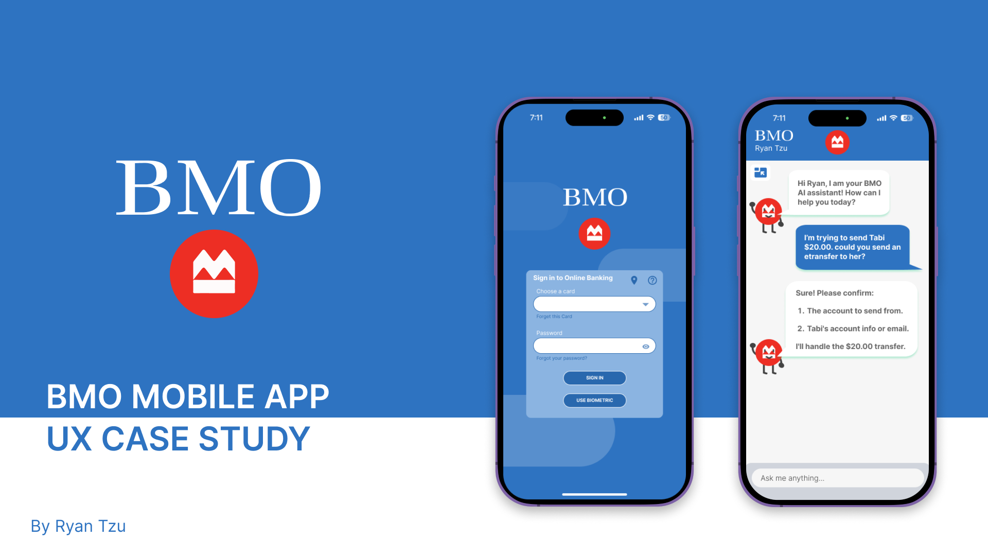
Project Goal
The objective of this project is to enhance BMO's online banking platform by integrating an AI companion. This AI companion will provide personalized assistance, streamline user interactions, and improve overall customer satisfaction. By leveraging advanced AI technologies, the AI companion will offer real-time support, answer customer inquiries, and help users navigate the platform with ease, thereby creating a more intuitive and efficient online banking experience.
Mission & Purpose
Mission: To revolutionize BMO's online banking experience by integrating a state-of-the-art AI companion, delivering personalized, efficient, and secure banking assistance to all users.
Purpose: To enhance customer satisfaction and streamline online banking interactions by providing real-time, intuitive support through an AI-powered companion, making banking easier and more engaging for BMO customers.
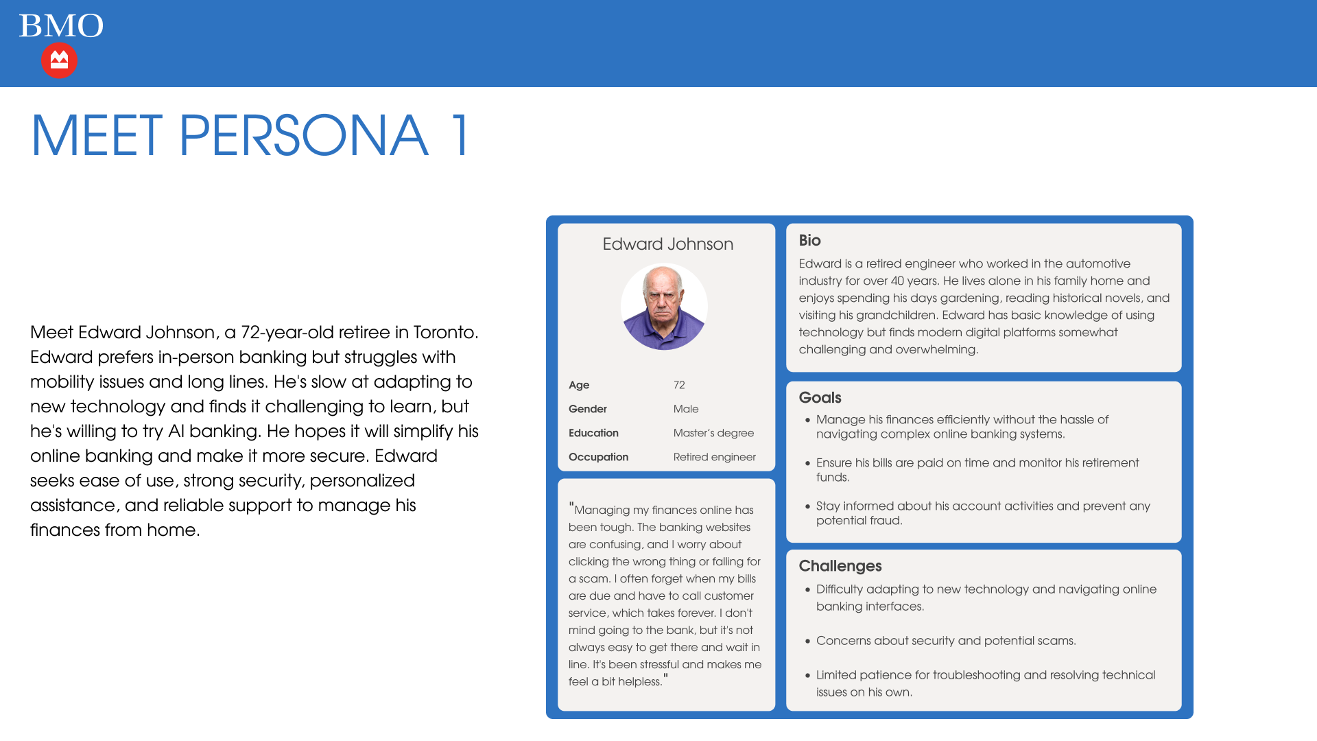
Meet Edward Johnson — Retired Engineer
Edward is a 72-year-old retiree in Toronto. He prefers in-person banking but struggles with mobility issues and long lines. He's slow at adapting to new technology and finds it challenging to learn, but he's willing to try AI banking. He hopes it will simplify his online banking and make it more secure. Edward seeks ease of use, strong security, personalized assistance, and reliable support to manage his finances from home.
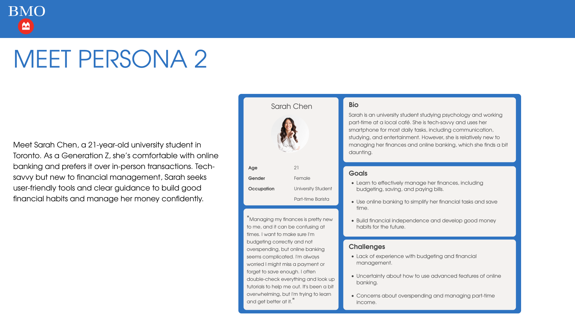
Meet Sarah Chen — University Student
Sarah is a 21-year-old university student in Toronto studying psychology and working part-time at a local cafe. As a Generation Z, she's comfortable with online banking and prefers it over in-person transactions. Tech-savvy but new to financial management, Sarah seeks user-friendly tools and clear guidance to build good financial habits and manage her money confidently.
Empathy Maps
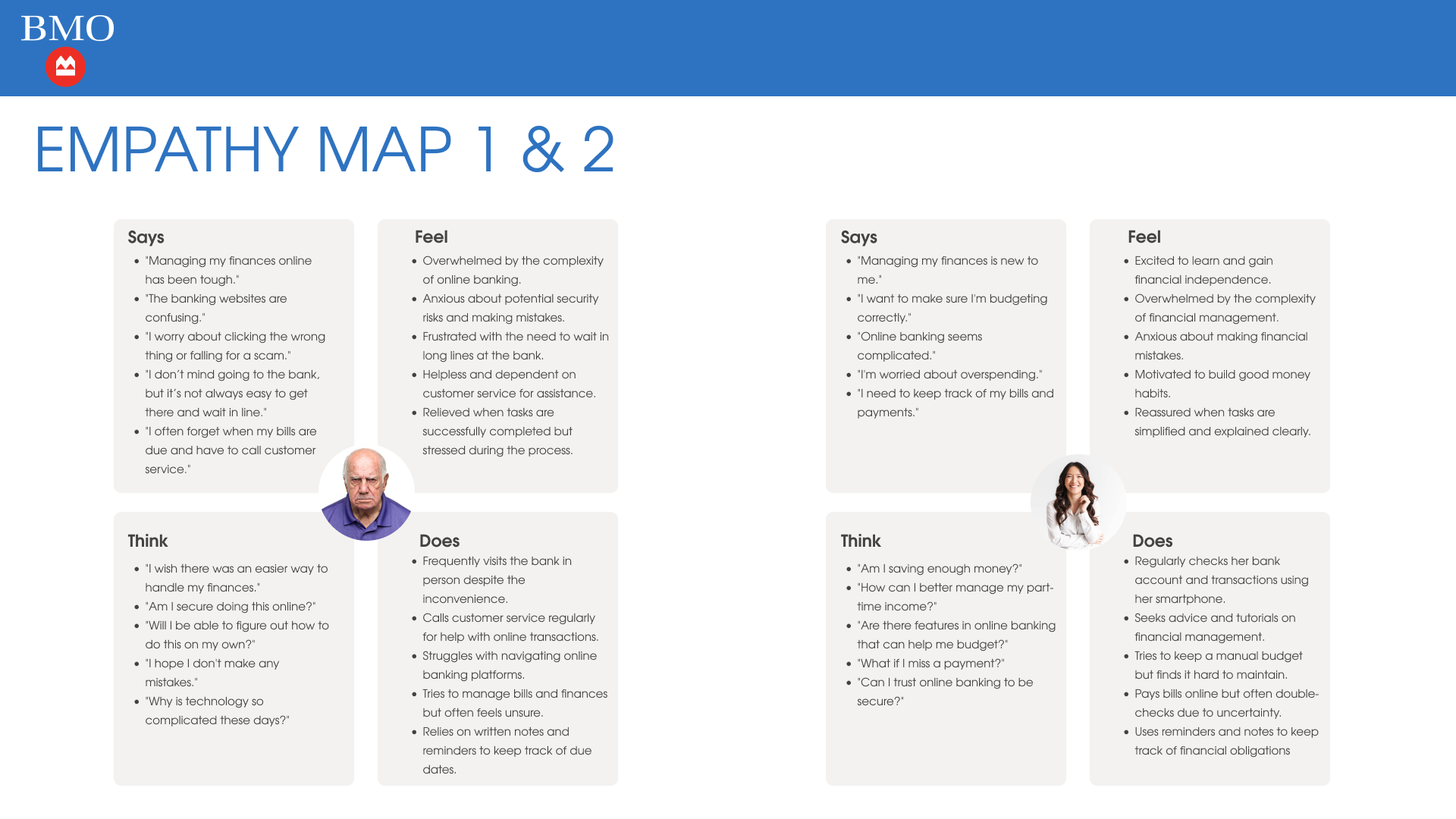
Edward's empathy map reveals feelings of being overwhelmed by online banking complexity, anxious about security risks, and frustrated with long bank lines. He frequently visits the bank in person despite inconvenience and relies on written notes and customer service calls to manage his finances.
Sarah's empathy map shows excitement about gaining financial independence alongside anxiety about making mistakes. She regularly checks her bank account on her smartphone, seeks tutorials on financial management, and tries to maintain a manual budget but finds it difficult.
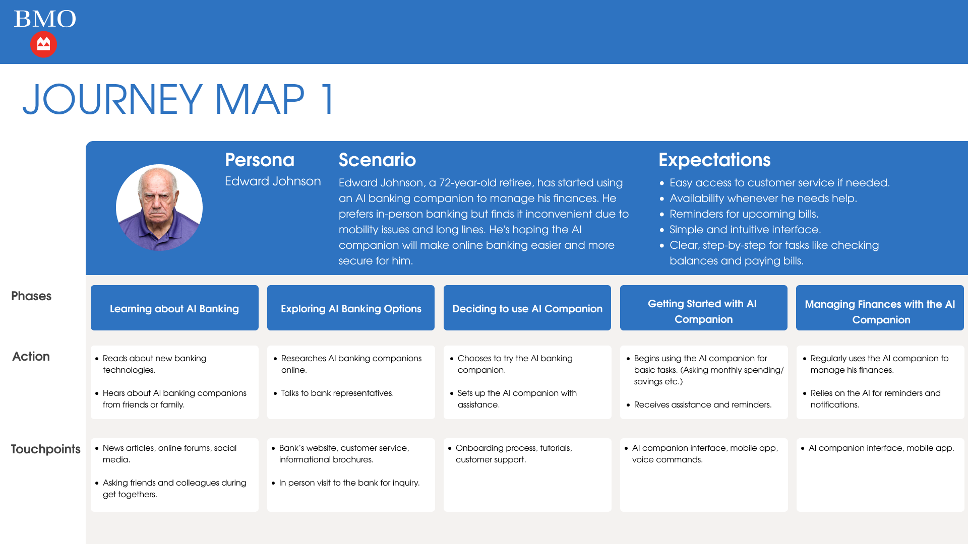
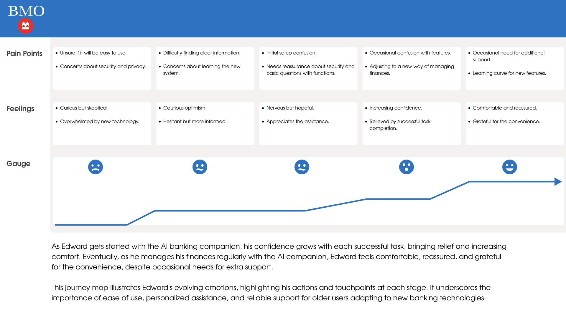
Journey Map — Edward Johnson
Edward's journey progresses through five phases: Learning about AI Banking, Exploring AI Banking Options, Deciding to use AI Companion, Getting Started, and Managing Finances. His confidence grows with each successful task, bringing relief and increasing comfort. Eventually, Edward feels comfortable, reassured, and grateful for the convenience, despite occasional needs for extra support.
This journey map underscores the importance of ease of use, personalized assistance, and reliable support for older users adapting to new banking technologies.
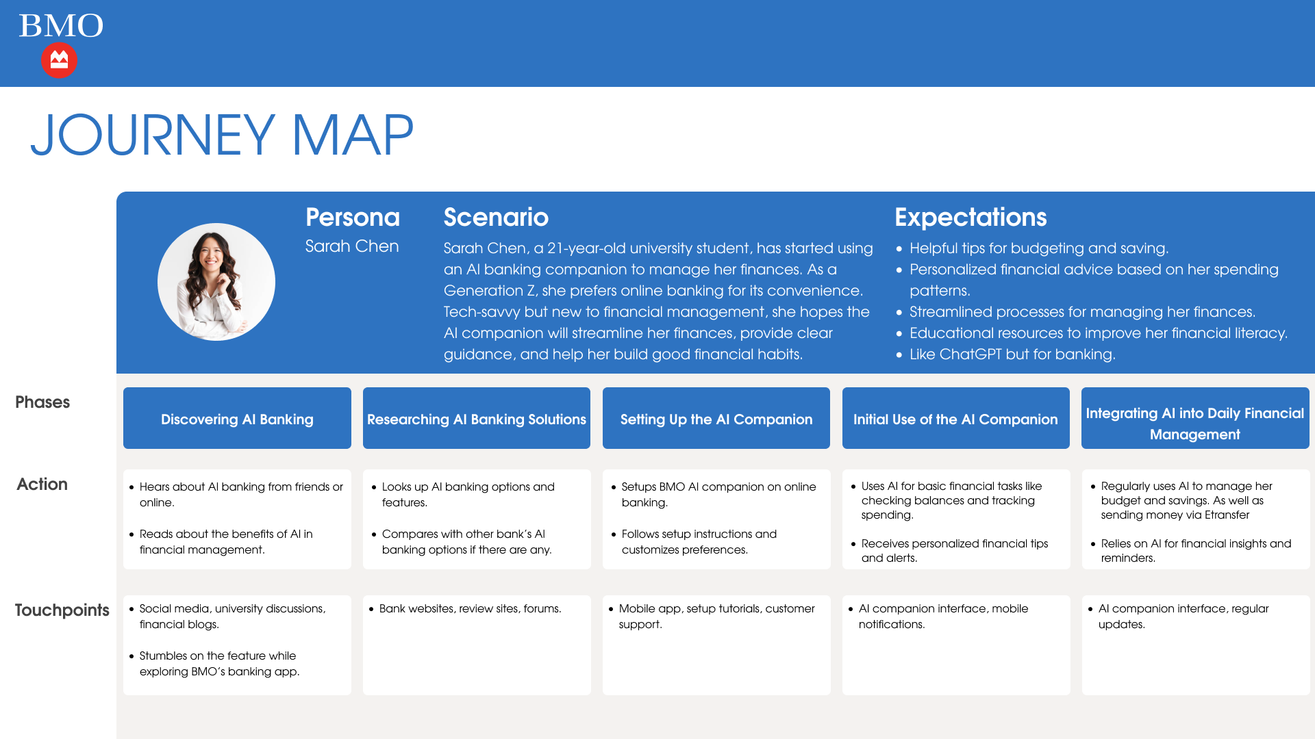
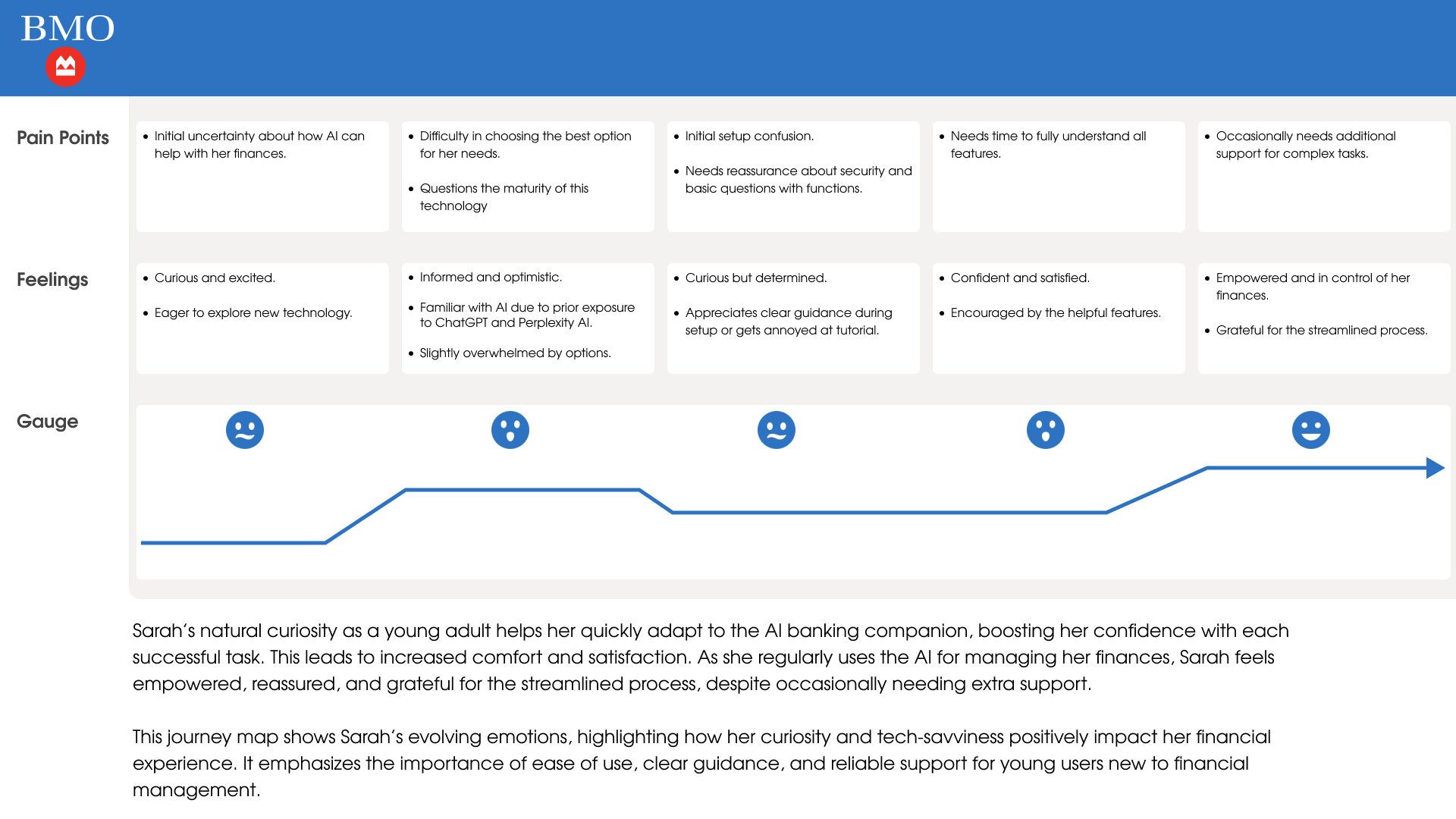
Journey Map — Sarah Chen
Sarah's journey spans Discovering AI Banking, Researching AI Banking Solutions, Setting Up the AI Companion, Initial Use, and Integrating AI into Daily Financial Management. Her natural curiosity as a young adult helps her quickly adapt to the AI banking companion, boosting her confidence with each successful task.
This journey map highlights how Sarah's curiosity and tech-savviness positively impact her financial experience. It emphasizes the importance of ease of use, clear guidance, and reliable support for young users new to financial management.
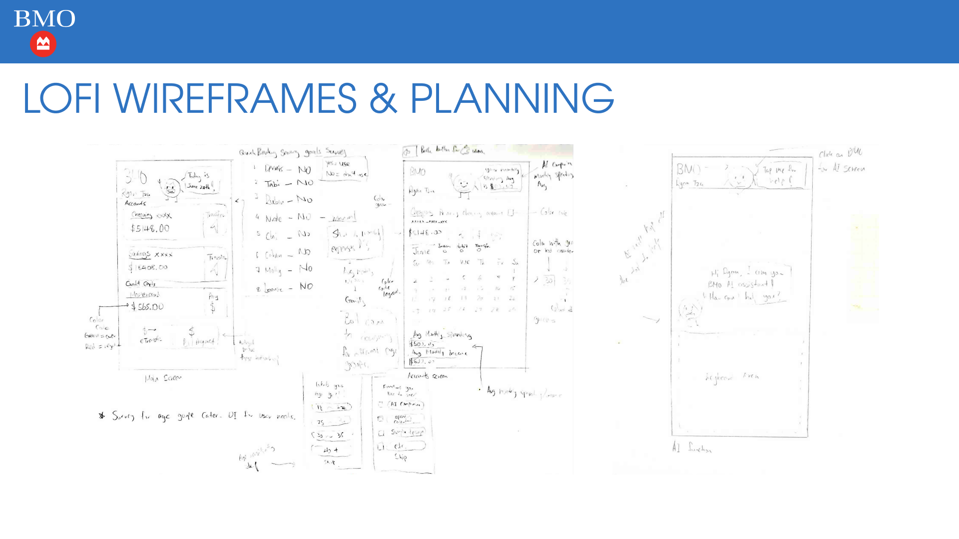
Lofi Wireframes & Planning
Early-stage sketches exploring the main screen layout, account views, AI companion interaction, and color-coding system. These wireframes helped establish the information architecture and validate the core user flows before moving into high-fidelity design.
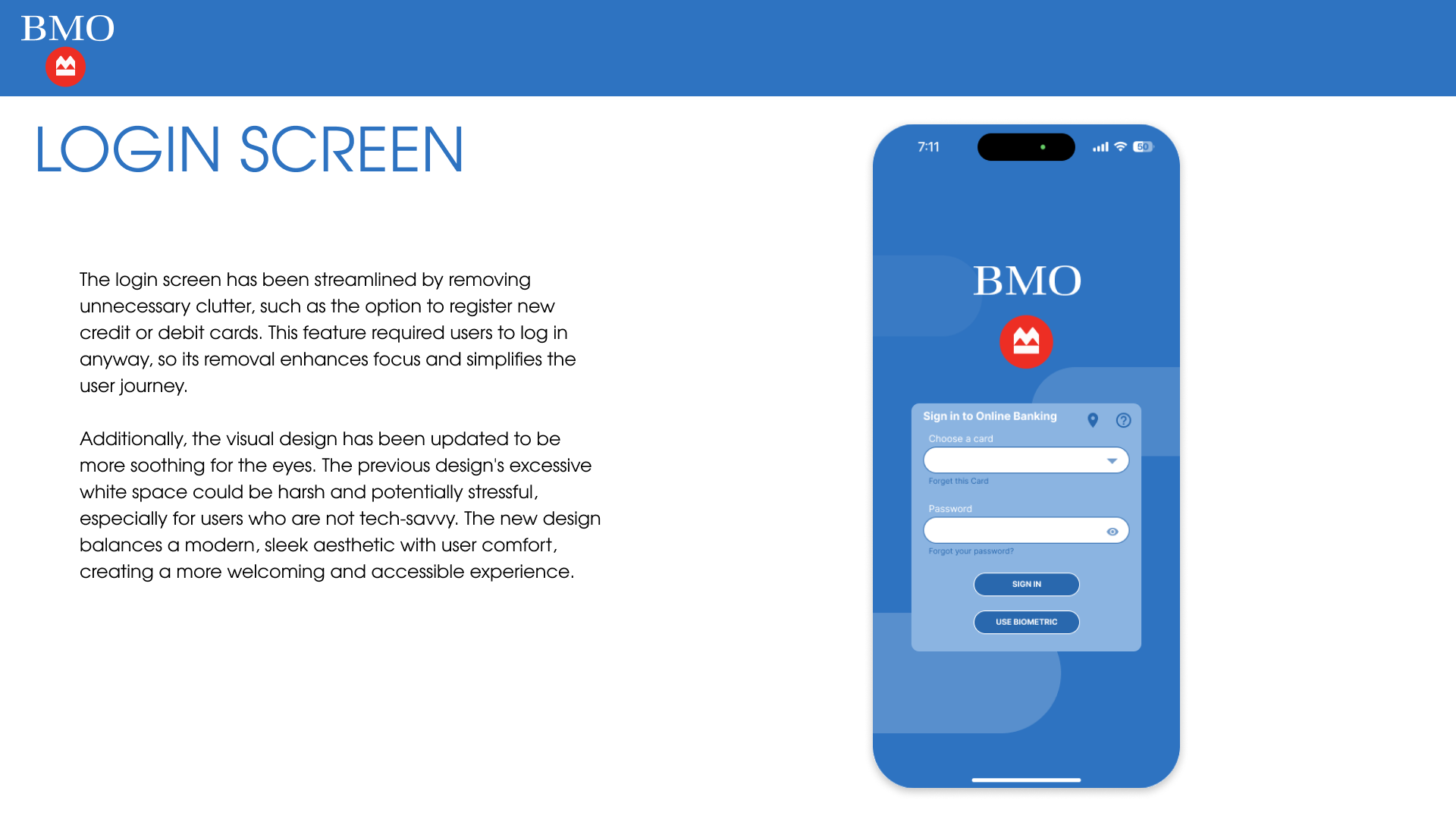
Redesign — Login Screen
The login screen has been streamlined by removing unnecessary clutter, such as the option to register new credit or debit cards. This feature required users to log in anyway, so its removal enhances focus and simplifies the user journey.
Additionally, the visual design has been updated to be more soothing for the eyes. The previous design's excessive white space could be harsh and potentially stressful, especially for users who are not tech-savvy. The new design balances a modern, sleek aesthetic with user comfort, creating a more welcoming and accessible experience.
Redesign — Home Screen
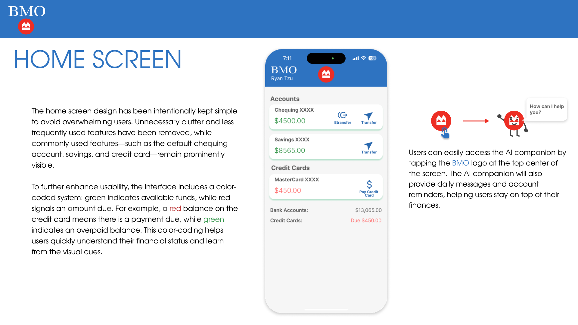
The home screen design has been intentionally kept simple to avoid overwhelming users. Unnecessary clutter and less frequently used features have been removed, while commonly used features — such as the default chequing account, savings, and credit card — remain prominently visible.
To further enhance usability, the interface includes a color-coded system: green indicates available funds, while red signals an amount due. This color-coding helps users quickly understand their financial status and learn from the visual cues.
Users can easily access the AI companion by tapping the BMO logo at the top center of the screen. The AI companion will also provide daily messages and account reminders, helping users stay on top of their finances.
Redesign — Account Screen
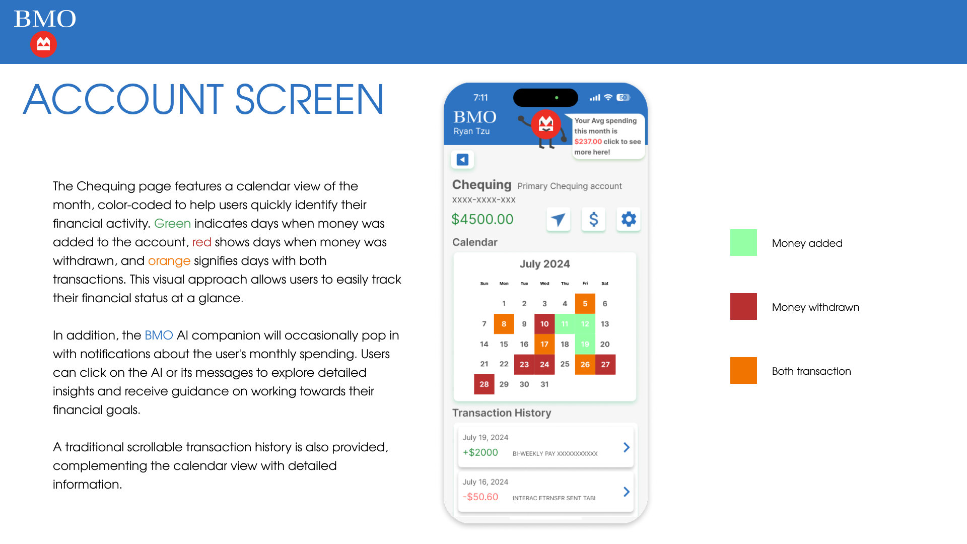
The Chequing page features a calendar view of the month, color-coded to help users quickly identify their financial activity. Green indicates days when money was added, red shows days when money was withdrawn, and orange signifies days with both transactions. This visual approach allows users to easily track their financial status at a glance.
In addition, the BMO AI companion will occasionally pop in with notifications about the user's monthly spending. Users can click on the AI or its messages to explore detailed insights and receive guidance on working towards their financial goals. A traditional scrollable transaction history is also provided, complementing the calendar view with detailed information.
Redesign — AI Companion Screen
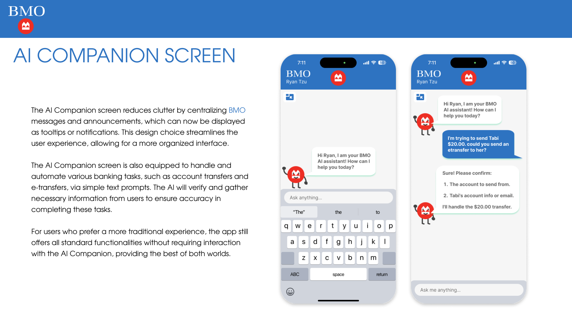
The AI Companion screen reduces clutter by centralizing BMO messages and announcements, which can now be displayed as tooltips or notifications. This design choice streamlines the user experience, allowing for a more organized interface.
The AI Companion screen is also equipped to handle and automate various banking tasks, such as account transfers and e-transfers, via simple text prompts. The AI will verify and gather necessary information from users to ensure accuracy in completing these tasks.
For users who prefer a more traditional experience, the app still offers all standard functionalities without requiring interaction with the AI Companion, providing the best of both worlds.
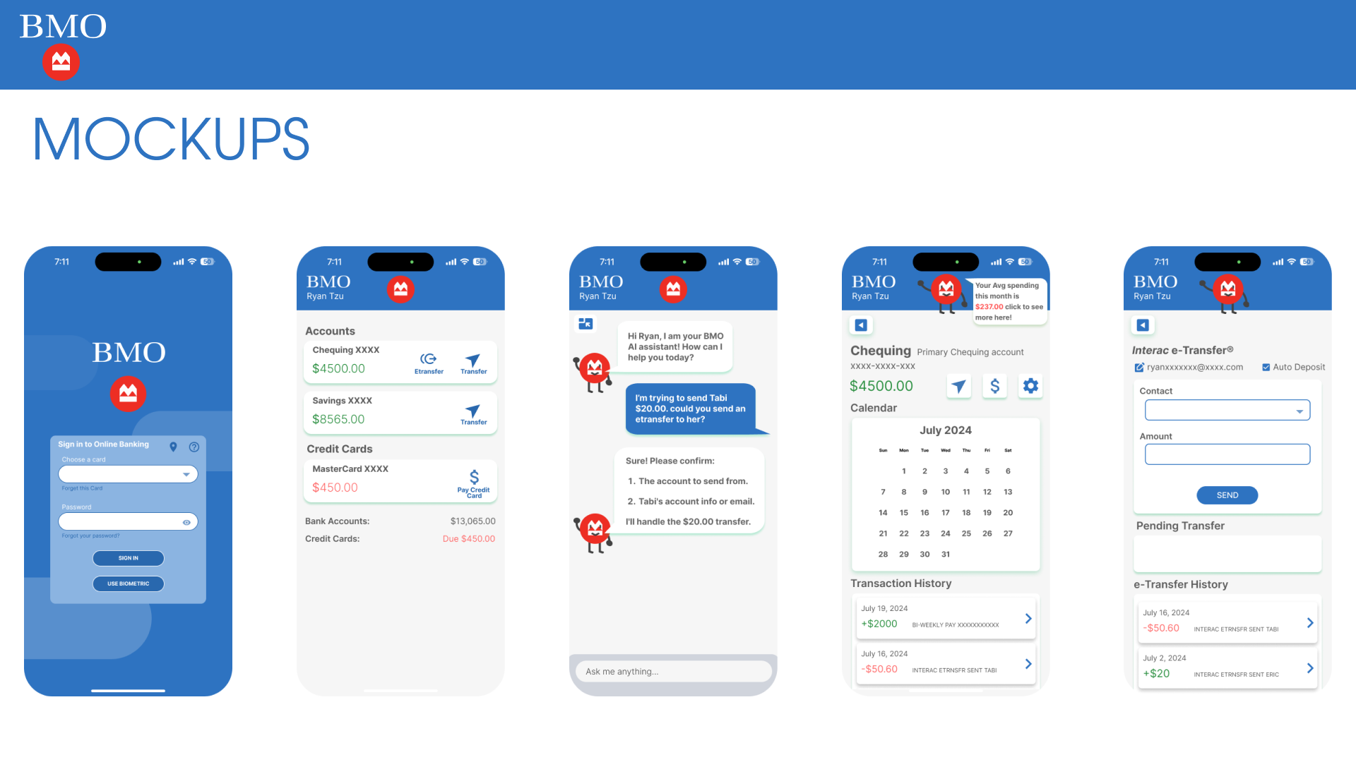
Mockup Showcase
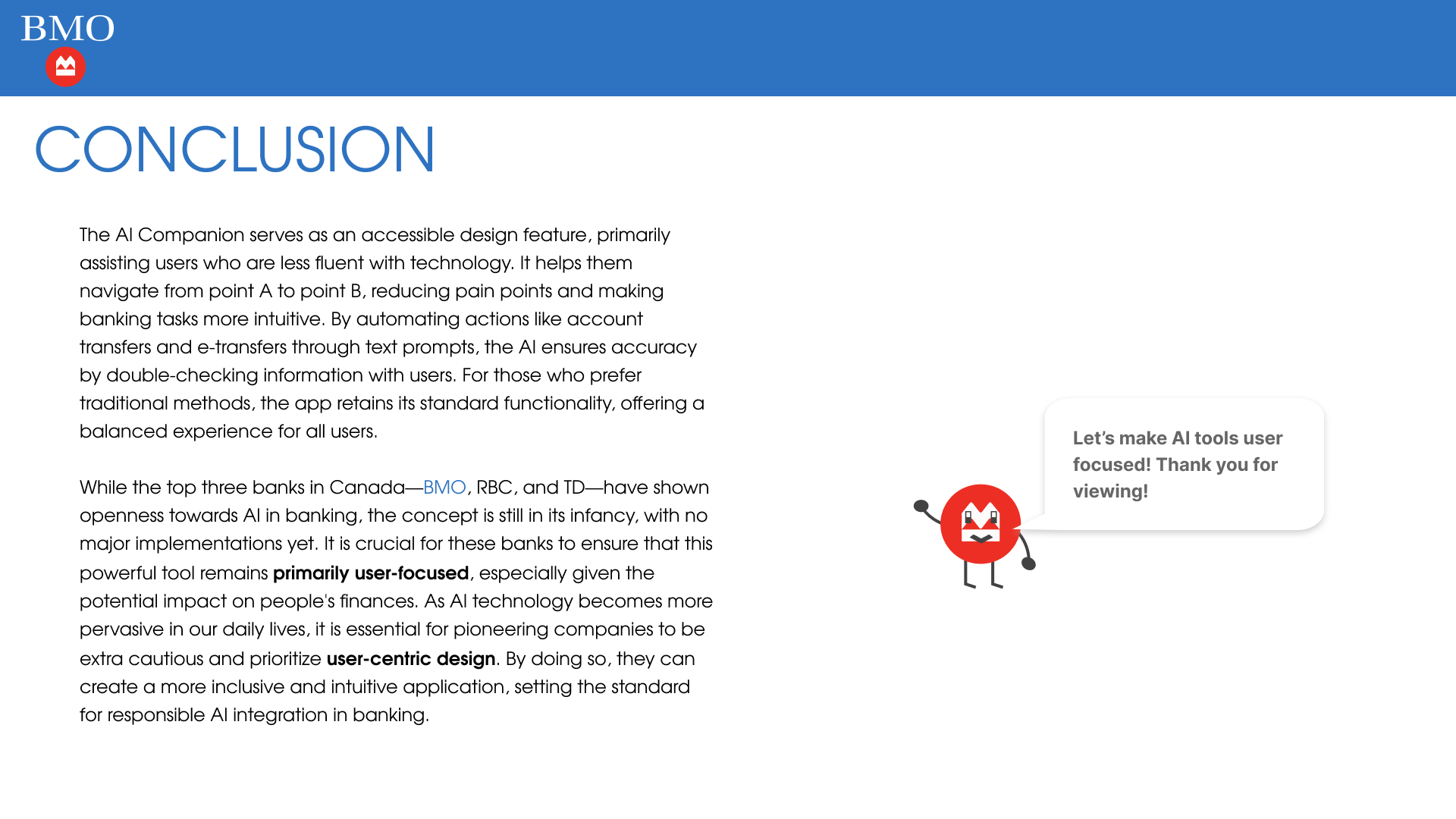
Conclusion
The AI Companion serves as an accessible design feature, primarily assisting users who are less fluent with technology. It helps them navigate from point A to point B, reducing pain points and making banking tasks more intuitive. By automating actions like account transfers and e-transfers through text prompts, the AI ensures accuracy by double-checking information with users. For those who prefer traditional methods, the app retains its standard functionality, offering a balanced experience for all users.
While the top three banks in Canada — BMO, RBC, and TD — have shown openness towards AI in banking, the concept is still in its infancy, with no major implementations yet. It is crucial for these banks to ensure that this powerful tool remains primarily user-focused, especially given the potential impact on people's finances. As AI technology becomes more pervasive in our daily lives, it is essential for pioneering companies to be extra cautious and prioritize user-centric design. By doing so, they can create a more inclusive and intuitive application, setting the standard for responsible AI integration in banking.
Interactive Prototype
Please request an invite link to access the prototype.