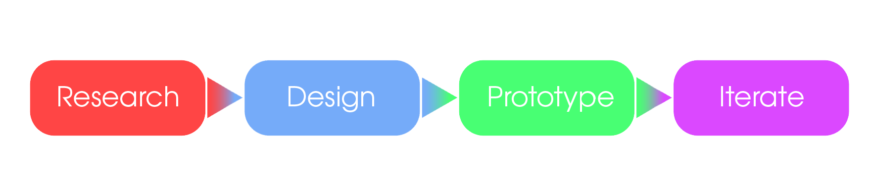
Design Process
This project followed a four-phase design process: Research, Design, Prototype, and Iterate. Each phase built on the previous, ensuring user insights drove every design decision from initial discovery through final testing.

Initial Research & Design Opportunity
The current Toronto Cupcakes website is not user-friendly and struggles to engage visitors effectively. To enhance user experience, it's essential to rebrand the site and simplify the online ordering process. This will attract food enthusiasts and tourists, ensuring a seamless and enjoyable customer journey. The goal is to make the website a delightful and convenient destination for all, ultimately driving customer satisfaction and business growth.
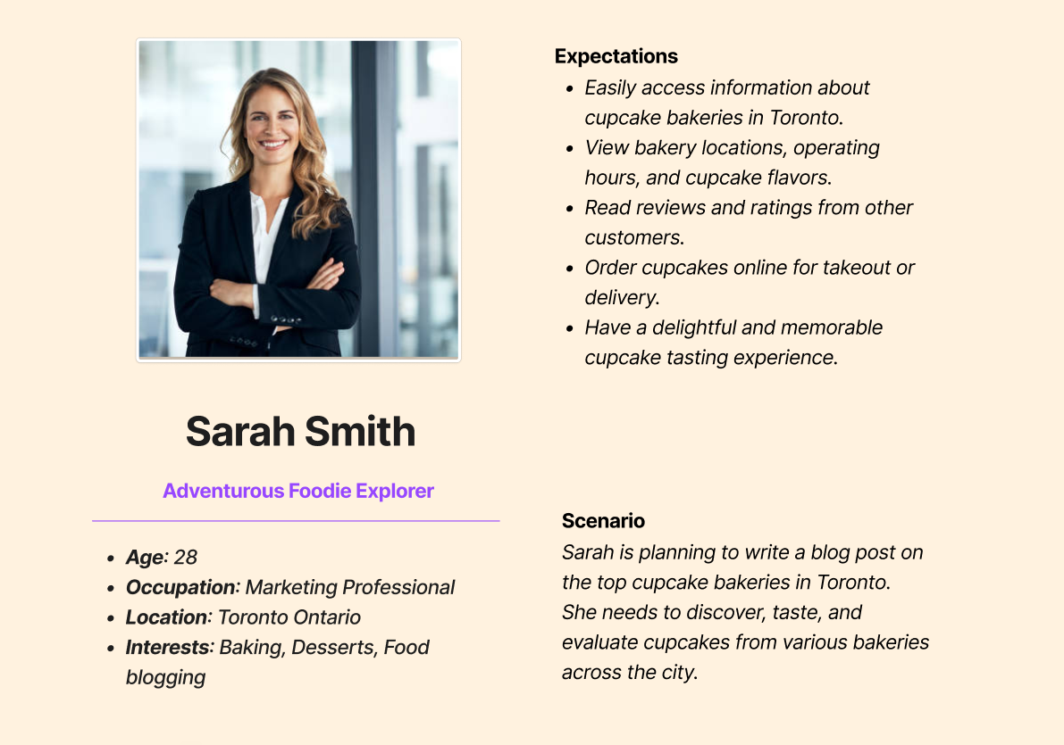
Meet the Persona — Sarah Smith
Sarah Smith is a 28-year-old Marketing Professional and adventurous foodie explorer based in Toronto, Ontario. She has a passion for baking, desserts, and food blogging. Sarah dedicates her weekends to trying diverse artisan foods and curious fusion delights.
Sarah is planning to write a blog post on the top cupcake bakeries in Toronto. She needs to discover, taste, and evaluate cupcakes from various bakeries across the city.
Journey Map
This journey map outlines Sarah's experience as she explores Toronto's cupcake scene. It highlights the various phases, touchpoints, emotions, and opportunities for improving the user experience on bakery websites. By focusing on these opportunities, Toronto Cupcakes can enhance its online presence and provide a delightful experience for cupcake enthusiasts like Sarah.
Pain Points
Research: Sarah may face frustration due to outdated information on bakery websites. Inaccurate data on operating hours, cupcake flavors, or pricing can lead to disappointment.
Planning Visit: Some bakeries might not provide online ordering, necessitating in-person visits. This can be inconvenient, particularly when exploring multiple bakeries in one day.
Visiting Bakery: Sarah might encounter cupcakes that do not meet her taste, texture, or freshness expectations.
Review and Blogging: A lack of community or engagement on bakery websites can leave Sarah feeling disconnected.
Repeat Visit: The multitude of bakeries in Toronto could feel overwhelming, making it challenging to decide which ones to visit first.
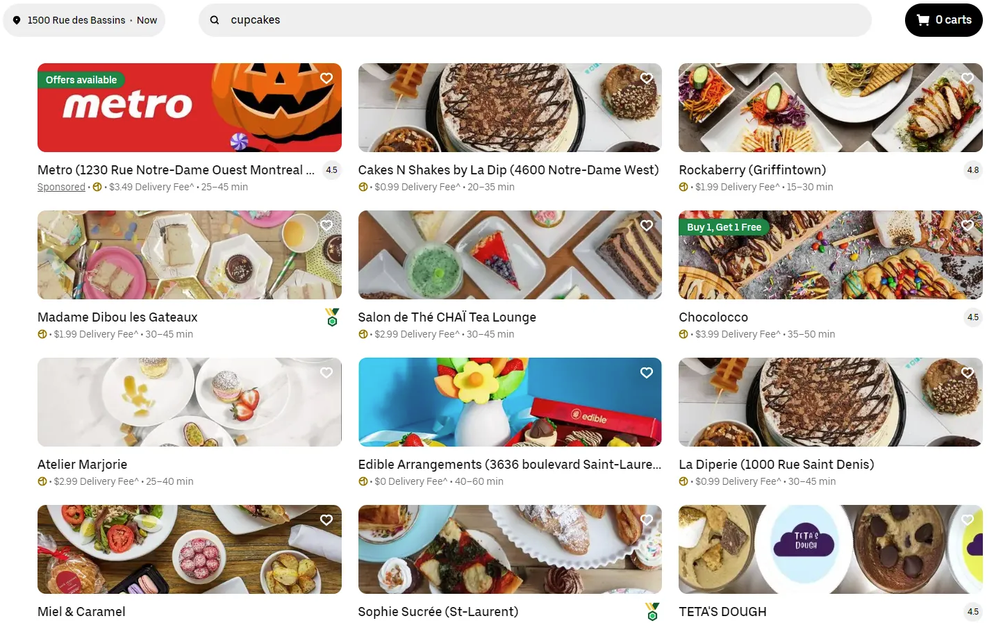
Competitive Audit
When we talk about Toronto Cupcakes, it's essential to consider the big players in the food delivery game — companies like Uber Eats, Skip the Dishes, and DoorDash. Toronto Cupcake is an independently owned business, so its delivery operations are on a smaller scale. There are also local bakeries and coffee shops which offer a warm, cozy atmosphere for foodies to hang out and savor delightful treats.

Lofi Wireframes
Initial paper sketches exploring the core page layouts: Home Page, About Us, Order page with product categories, and Login with loyalty rewards. These wireframes established the information architecture and key user flows before moving into digital design.
Hifi Wireframes
Digital wireframes translating the paper sketches into a polished layout. These mid-fidelity screens were used for initial usability testing before applying the final visual design.
Usability Testing Results
During user testing, we observed a notable improvement in the website's usability and user satisfaction. Participants overwhelmingly preferred the new and more modern design, especially when compared to the paper prototype phase.
Out of the 5 people tested, all preferred the new modern feel and look for the final design. However, 2 out of the 5 expressed a desire for more accessibility features. 3 out of the 5 users appreciated the search function. All 5 users found the new site easy to navigate, indicating that the redesign has been successful in creating a user-friendly experience.
Final Mockups
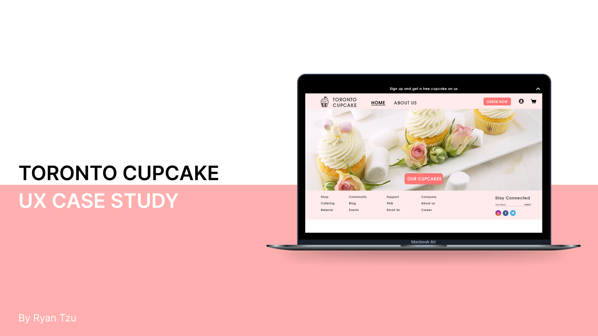
Homepage
The redesigned homepage features a full-bleed hero image with a prominent "Our Cupcakes" CTA, a sign-up banner offering a free cupcake, and a comprehensive footer with Shop, Community, Support, and Company links alongside social media integration and email newsletter signup.
About Us
The About Us page showcases four content sections — Events, Community, FAQ, and Connect — using engaging photography to draw users into the brand story and build a sense of community around Toronto Cupcake.
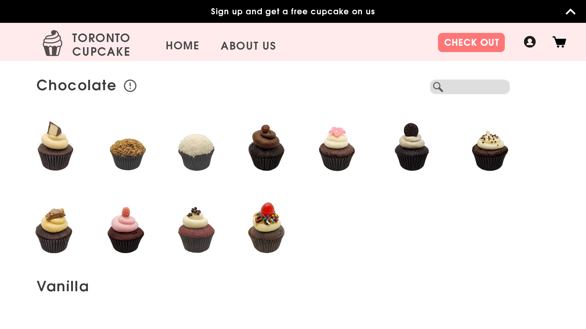
Order Page
The order page organizes cupcakes by flavor category (Chocolate, Vanilla, etc.) with a search function and clear visual grid. Users can browse the full selection at a glance and quickly find specific flavors.
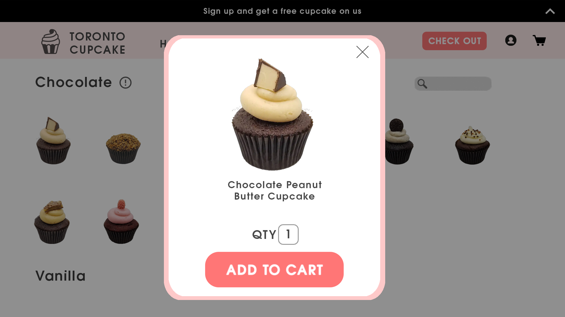
Product Detail
Clicking a cupcake opens a modal with an enlarged product image, name, quantity selector, and a prominent "Add to Cart" button. The modal overlay keeps users in context with the browse page visible behind it.
Outcomes & Lessons Learned
This project taught me the value of prior knowledge in any project. Knowing the industry and subject matter makes a big difference in the quality of research and the final product. I also realized how important it is to connect with people who can understand my target audience.
If I could start over, I'd spend more time planning and researching. This project highlighted the importance of industry knowledge, the value of connecting with the right people, and the need for careful planning in design.